Jenny Morgan lives and works in New York, USA. Her paintings are a combination of hyper-realism and abstract, with her figures sometimes being blurred or a hand is painted a bold, solid colour. It gives an interesting element to figurative and portrait painting.
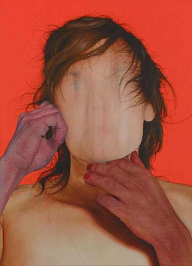
‘Let Go 2010’ shows a portrait with a blurred out face. It looks although the face, which had once been painted, has been wiped away in a vertical action. I wonder if it’s symbolic of some form of identity censorship. Morgan has kept the very fine hairs which creep across the figures face. It is just the facial features which are obstructed.
There are hands framing the face, delicately touching the cheek and under the chin. These hands are painted with a dark skin tone, taking a redness from the solid red background. Do the hands belong to the figure? Or to someone else? The hands appear as if collaged in place, not fitting correctly with the rest of the painting, and yet it still works.
Morgan’s work is extensive, with multiple exhibitions and opportunities to see her work in person. I find her work to be really exciting and interesting; an organic development in the field of figurative work without staying completely true to the model’s form.
Whilst in Birmingham earlier this week, I picked up a catalogue for the New Art West Midlands. This is where I saw this piece, by a recently graduated artist, Georgia Henn. The installation is described as 74 documentary photographs, Perspex tubes and photographic display mounts.
Georgia Henn – Review on Thursday 2015
The piece originally reminded me of David Hockney’s photographic work, where he photographs a subject from multiple angles to build a cubist inspired impression of the subject. Henn has used documentary style photographs of her grandfather whilst in hospital. Where the photographs are suspended on different heights, the piece gives a fresh perception on its depth, and explores the combination of photography and sculpture as an artistic medium.
The catalogue describes the work as:
Its aesthetic, materials and subject give the work a clinical feel; when seen as one image, it appears to both isolate and rupture the body, making it dissolve into the walls and into the ether. The effect is curious and melancholic, at odds with what we might expect of a portrait of a cherished family member.
From my own experience, when visiting a loved one in hospital I find it hard to focus on the body in the bed, and often observe the different objects and surfaces of the room. Henn’s piece still allows me to do so, even with the portrait being the focal point. It looks like a fascinating installation, which I wish I could see in person.
More of her work is available on her website here.
Weshcke’s paintings are very emotive, and are often made from his direct observations and life experiences. He originally trained as a sculptor, but was inspired to paint whilst living on the coast of Cornwall. His paintings ‘Body on the beach’, ‘Caliban’ and his ‘Floating Figure’ series are responses to an accident he had where he almost drowned. In an interview for a television series, Weshcke describes how he was painting ‘Caliban’ whilst listening to a radio adapation of the Shakespearean play ‘The Tempest’, in which he found Caliban’s character relatable to the almost drowned figure on the beach. I find it fascinating how Weshcke has added to the foundation of using his own experience, and taking outside sources such as literature to add to the ‘scene’. The title of the work is the only part which gives that influence away.
His paintings are dark and moody, perhaps a metaphor for that time in his life. The lonely isolated figure, which looks discarded on the sand, has been painted with loose, rough brush strokes. I think this may represent the urgency and desperation he feels to that incident. His background landscape, although obviously coastal, is very simplistic and doesn’t take from the figure in the foreground.
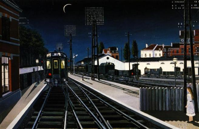
Paul Delvaux was a Belgian Painter known best for his Surrealist work. The painting of his which I have chosen is a cityscape, set in the night and showing a train set a station. It’s painted from an interesting perspective, where Delvaux would have had to have stood in the centre of the train tracks to have achieved this perspective. It leads me to wonder if he painted more from memory or mind than life. During the 1950s Delvaux painted a lot of train scenes, perhaps fuelled by the memory of his first experience and fascination seeing the electric trams in Brussels.
There is a figure of a young girl in the right hand corner of the painting, although she has a mysteriously strong shadow cast from the thin crescent moon, she has almost no three-dimensional shading on her body or clothes. I’ve noticed this to be a feature of his style, his figures lie flat on the canvas and don’t seem to be close to life-like.
There is a strong contrast of colour in his palette for this painting, with the blues of the night sky, white of the buildings in the distance, the red brick work of the station building on the left which can just be made out in the light from the window, and the yellow glowing from the train windows, emphasising the unnatural electrical light.
The painting is divided through his use of life, with my eye being caught and carried up the extending train track, as we assume it heads off into the horizon. It does make me wonder where the train is destined for, especially at that time of night. Not to mention where the parents of the young girl are. As someone who is not a fan of much landscape art, there is something about this painting which really does appeal to me.
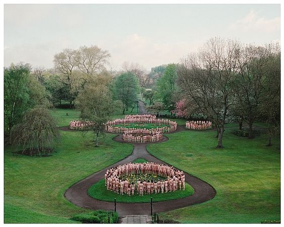
Spencer Tunick is an American Photograph who is known for his nude photography, often containing a mass of people. Although the medium used is technically photography, the pieces are actually a documentation of an installation. Tunick uses the nude bodies to occupy and fill a space, changing its meaning and then documents the event through a well compositioned photograph.
His work certainly makes a statement. Nudity has been used throughout art for almost as long as art has been around, but Tunick’s photographs help to normalise the naked human body through repetition. It is more common to see the naked body associated with sex than anything else. Especially using photography and nudity, Tunick ran the risk of his work being potentially viewed as pornographic – which it certainly isn’t. Nudity and sexuality is everywhere in Western culture, through advertising and TV, and so it is refreshing for an artist to take the literal nude form and reclaim it as something which is not sexual.
Tunick’s installations use a variety of landscapes and locations, some familiar and some not. Perhaps his reasoning is to inject the natural human body back into the world, and remind us that we are part of it.
He has been known to grade his models by age, gender, hair length or skin tone, to achieve different looks within his work. It’s possible to sign up to take part in one of his photographs using this form on his website.
In celebration of International Women’s Day, I wanted to write about one of my favourite female artists and feminist icons: Frida Kahlo. Mexican Artist Kahlo was not afraid to paint real experiences that women face rather than ‘lovely’ scenes of a smoothed over existence. It is easy to see how she has influenced many artists who are working today, such as Tracey Emin, particularly with their work surrounding birth, abortion and miscarriage. Kahlo was open about being bisexual, and refused to get rid of her ‘masculine’ features such as her iconic monobrow. Nowadays, I would not be surprised if she would chose to identify as non-binary. Her work serves as a great influence to me, seeing her passion painted onto canvas.
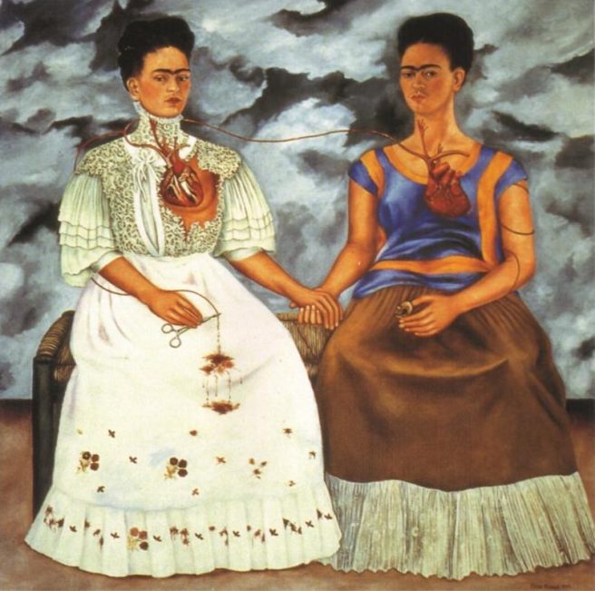
Frida Kahlo – The Two Fridas 1939
‘The Two Fridas 1939’ was one of Kahlo’s first large scale oil paintings. She took up painting whilst on bed-rest recovering from a car accident which stopped her being able to bear children. According to her website, this piece was completed after her divorce. It also reads:
This portrait shows Frida’s two different personalities. One is the traditional Frida in Tehuana costume, with a broken heart, sitting next to an independent, modern dressed Frida.
For me, the real focus of this painting are the hands, the two that are holding one another. Even though the painting shows Frida’s two personalities, it is a representation of her own inner strength to support herself through the difficult time she was going through. This is mirrored with the artery which connects both of their hearts, although ‘traditional’ Frida’s heart is broken and severed, bleeding onto her dress. I see that as Frida letting go of her heritage and traditions, perhaps brought on by her divorce.
Both figures gaze towards us with an unimpressed look, like we are not welcome to view them. There is a dark and stormy sky behind them, perhaps a metaphor for her mood and emotion at the time of the painting.
More of her work is available to see and read about on her website here.
Hans Bellmer was a German Artist, who is considered to be a Surrealist Photographer. He’s best known for making pubescent and abstract dolls. ‘The Doll 1936’ is a photograph of the second doll that he made. I find it difficult to really define the medium of this piece, whether it be sculpture or photography, as neither would exist without the other.
I find Bellmer’s work equally disturbing and fascinating. They are strangely shaped, unnaturally twisted figures which are neither true to life nor completely abstract. The dolls are recognisable as holding physical human qualities and features whilst still being grotesque. Theartstory.org describes holds an interesting description of his practice;
Hans Bellmer’s art, often in the form of dolls he called language images, served as a form of personal therapy, in which he objectified abusive relationships, explored his fantasies, and projected the essence of his desire for women and objects.
Sigmar Polke was a German Painter and Photographer. I find his work to be instantly recognisable by the large pixelated dots used in the photographic element of the pieces. It feels reminiscent of Roy Lichtenstein and the Pop Art movement, only without the bright and bold colours and stylised illustration. The Tate website describes his style as:
His paintings combine found printed images with more organically-made painterly marks. He uses half-tone photography from newspapers and magazines, enlarging and reproducing it on canvas, often corrupting the original beyond recognition.
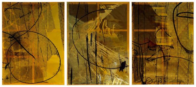
Sigmar Polke – Untitled (Triptych) 2002
When Polke returned to painting later in his career, he became interested in combining materials and elements within his paintings. I mostly know of his figurative work, and so was really intrigued by the ambiguity of the piece ‘Untitled (Triptych) 2002’. The marks could be interpreted differently by different people. I find myself more drawn to the aggressive, vertical black painted lines over the circular shapes. There are different areas of the photograph on resin background which jump out at me the longer I stare at each piece. I see there to be a progression in movement across the triptych, with the circles appearing to move across from the left to the right, and almost off the plane completely. The colour palette is not terribly wide in this piece, whereas some of his work has been highly colourful. However, I do think that the simpler colour palette works for highlighting and emphasising his mark making, which is the focus of this particular piece.
Although he doesn’t have his own website, more information can be found about him and his work here.
Damien Hirst – St Bartholomew, Exquisite Pain 2006
Damien Hirst is a controversial artist associated with the Young British Artists group. YBA was a group who exhibited together in 1988 and onwards after graduating, and were supported by Charles Saatchi. The group became renowned for their shock tactics, something which I consider Hirst to have held onto throughout the continuation of his career. He is greatly known for his works involving and exploring the theme of death, using preserved animal corpses and creating and ending the lifespan of flies, all of which are shown on his website.
Hirst’s work tends to push the boundary on art and science, using techniques which are not readily available to the everyday working artist. He also has a team of technicians which assist him in the physical creation of his pieces. ‘St Bartholomew, Exquisite Pain 2006’, being a bronze sculpture seems like a very traditional method of Hirst to have chosen. Perhaps he wanted to mirror the traditions of his Catholic upbringing, where he heard the story and saw images of the skinned apostle originally. I saw this piece in person at the Crucible Exhibition in Gloucester Cathedral back in 2010, and wouldn’t have known that it was by the famous Damien Hirst if I hadn’t read the information.
The image of the skinned apostle is not new. There are other visual representations of the story painted and sculpted throughout history. It may well be that Hirst’s exploration of the subject matter is more anatomically correct and perhaps gruesome. There seems to be a pride in the way he holds up the cutting instruments, with his skin still hanging onto his arm, like a strange and gorey call to war.
‘Saint Bartholomew, Exquisite Pain’ acts as a reminder that the strict demarcation between art, religion and science is a relatively recent development. Hirst explains that historically, depictions of Saint Bartholomew (the patron saint of doctors and surgeons) were often used by medics to aid their anatomy studies. In Hirst’s interpretation, the serene saint stands on a table littered with the tools used to make the original sculpture. He holds a scalpel, as according to traditional depictions, but also a pair of scissors. Inspired by Tim Burton’s film ‘Edward Scissorhands’ (1990), this addition implies that “his exposure and pain is seemingly self- inflicted. It’s kind of beautiful yet tragic.”
His own interpretation of his work gives a lot of food for thought. It makes me wonder how Hirst feels about his own mortality, especially seeing as it is such a prominent theme throughout his practice.
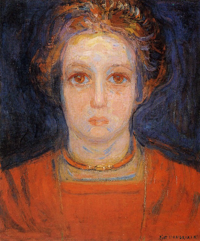
Piet Mondrian – Portrait of a Young Woman in Red 1908-09
Dutch Artist, Piet Mondrian is perhaps best known for his painting ‘Composition with Yellow, Blue and Red 1937-42’ and his continuation of some of the theories that Cubism paved the way for. In 1917, Mondrian became a principle member of the De Stijl which translates as The Style and was also known as Neo-Plasticism.It consisted of artists and architects who used both strong line and primary colours.
‘Portrait of a Young Woman in Red 1908-1909’ is not a painting that Mondrian is particularly remembered for, but shows that he had technical ability as a portrait painter. Although again, like Anthony Pilbro’s painting ‘Head 1991’, her face is not quite anatomically accurate. The eyes are two large, nose too long and straight, and perhaps the lips are too narrow. Her expression is calm and poised, directly looking out of the canvas to meet our gaze. I wonder if Mondrian created her to be an ideal, although not sexualised as her dress reaches the bottom of her neck. This woman is beautiful but not to be oggled at.
Mondrian’s use of fluid brushstrokes remind me of the painting style of Edvard Munch, who would have been working around the same time as Mondrian. Both artists seem to be a fan of creating a subtle indication of an aura in the coloured background.
It’s refreshing to see a different painting by an artist who is so well known for one piece in particular, especially where the style is so varied.